Netflix (new feature)
Overview
Role
UX Designer
Project Lead
Challenge
Implement a design solution that would create more awareness on Netflix original shows to develop a following. Our group decided to implement a social feature on the application that would promote collaboration and sharing shows between friends and family.
Tools
Zoom
Sketch
Photoshop
Mural
Marvel
Process
Established roles
Our first step was to establish roles; my role was to manage the persona, paper prototype and the high fidelity prototype.
Familiarized myself with the business needs and current user pain-points
Next we gave each person an artifact to lead, our goal was to better understand the business debrief and conduct user research to better understand the demographic and pain points of the target. To meet this goal, we set a research plan that would allow us to identify obstacles hindering our users in finding new shows and movies.
Synthesizing data, developing a persona, and identifying the problem statement
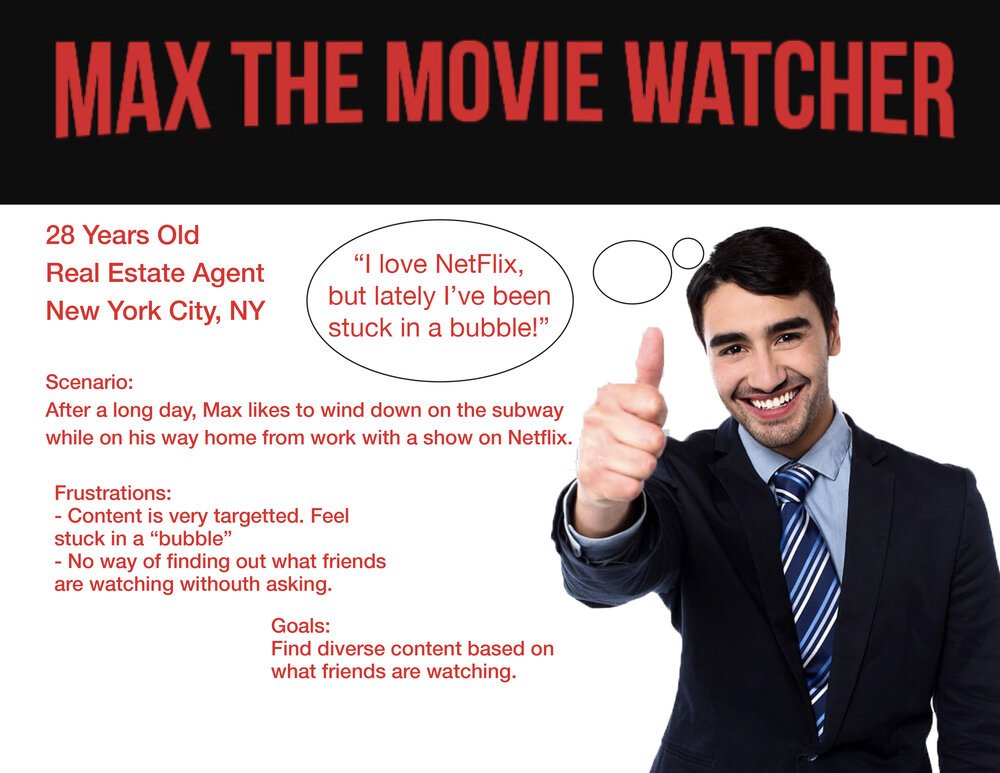
Then we conducted interviews. The majority of users brought up the point that they feel trapped in the algorithm. Another point was that once Netflix decided what genres you enjoy, the app will rarely stray from those types of recommendations. We concluded on a target audience and the pain points they may encounter when using the Netflix app. This guided the team to the creation of Max the Movie Watcher. The information collected also allowed us to hone in on a problem statement that would guide the rest of the project.
Problem statement:
“Max needs a way to discover and share new shows with friends so that he can break out of his current viewing bubble.”
Conducted divergent thinking exercises
After that we established a clear understanding of the user and their problems, our group conducted a design session in which we brainstormed solutions to the user problems. One of the exercises we used were “crazy eights” (to learn about this exercise there is a great article here).
Decided on prioritization and started designing
Once we gathered all of our ideas and played them back to each other our team decided to work on a prioritization map. For those not familiar, on a prioritization map, you map out on a graph what is of high importance and what is viable.
We concluded that we would create new features that would allow for adding friends to view others' watch lists and a new algorithm that creates suggestions based on friends’ watch histories and lists. Another part of this community feature would be a section where you can watch a clip of netflix orginal shows and movies and you can swipe right (and add them to your watch list) or left (and show you are not interested). Once we had a roadmap, we started designing the screens and uploaded them to Marvel to create low-fidelity clickable prototypes.
Kicked off user testing
Our next step was conducting usability testing on this low-fidelity prototype. We found that the “plus sign” that was meant to help people add friends was confusing and people thought they could add movies to their list and not friends. Another insight was that users were confused with the geometric circles through the new screens, thinking that they had similar functionalities. On a positive note, users enjoyed the possibility of seeing what friends are watching to help them decide what to watch next.
Converged findings into actionable items
The research helped us understand that users were having a challenge in navigating the app. To address this, we needed to make changes to key screens. Other obstacles users were facing was the lack of uniformity across the icons in the project as well as unclear onboarding for the Flixswipe feature. We used these findings to improve our designs and move on to a fidelity.
Iterating and testing…. again
After making the iterations, our team conducted another round of usability testing to better understand what needed to be changed before finalizing the most viable product (MVP). We used the last usability test as a north star for the development of the high fidelity prototype.
Conclusion
Our goal was to create a solution that would help users get exposed to new movies and shows on the Netflix app. We accomplished this by creating a new feature that would allow users to watch clip and show interest (or signify they are not interested) and where they can see what their friends are watching and have enjoyed. While our final high fidelity prototype satisfied the requirements of the MVP there are certain aspects of the design that we would have changed. Some areas of the design we would focus on would be making buttons and navigation more intuitive for users, continuing to create cohesive designs throughout the page, and conduct more usability testing to identify significant pain points before sending the design to the development team.


